Design Objective:
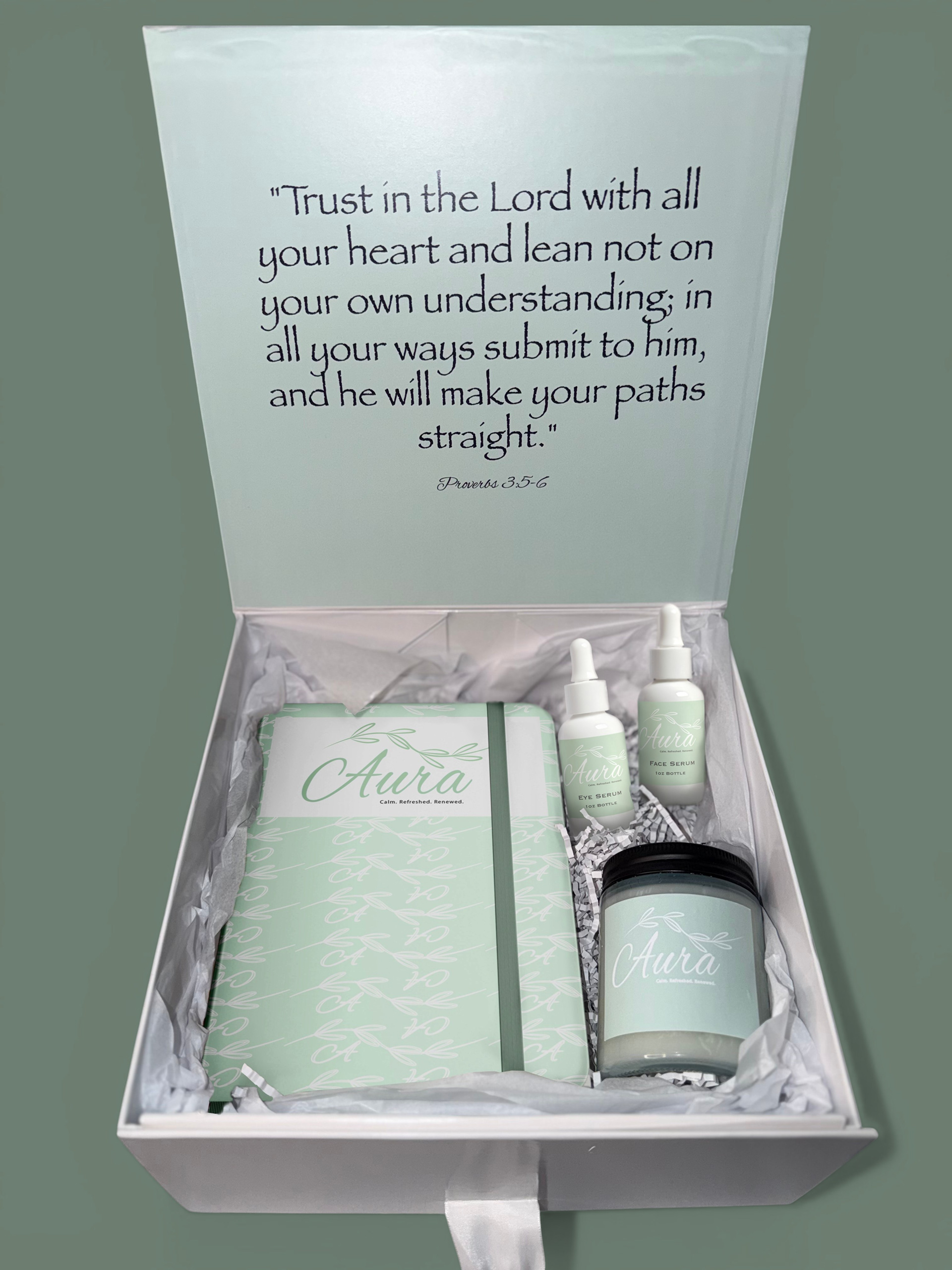
Develop a relaxation-focused subscription box designed to promote tranquility and inner peace. Create the box packaging and design two curated wellness items that support stress relief and mental rejuvenation. Establish a cohesive visual identity through calming colors, typography, and thoughtful design details that enhance the overall unboxing experience.
Develop a relaxation-focused subscription box designed to promote tranquility and inner peace. Create the box packaging and design two curated wellness items that support stress relief and mental rejuvenation. Establish a cohesive visual identity through calming colors, typography, and thoughtful design details that enhance the overall unboxing experience.
Design Brief:
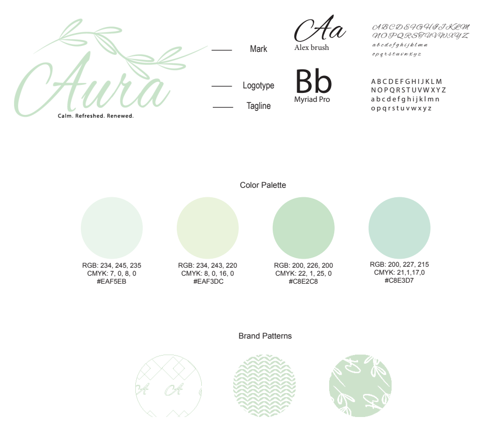
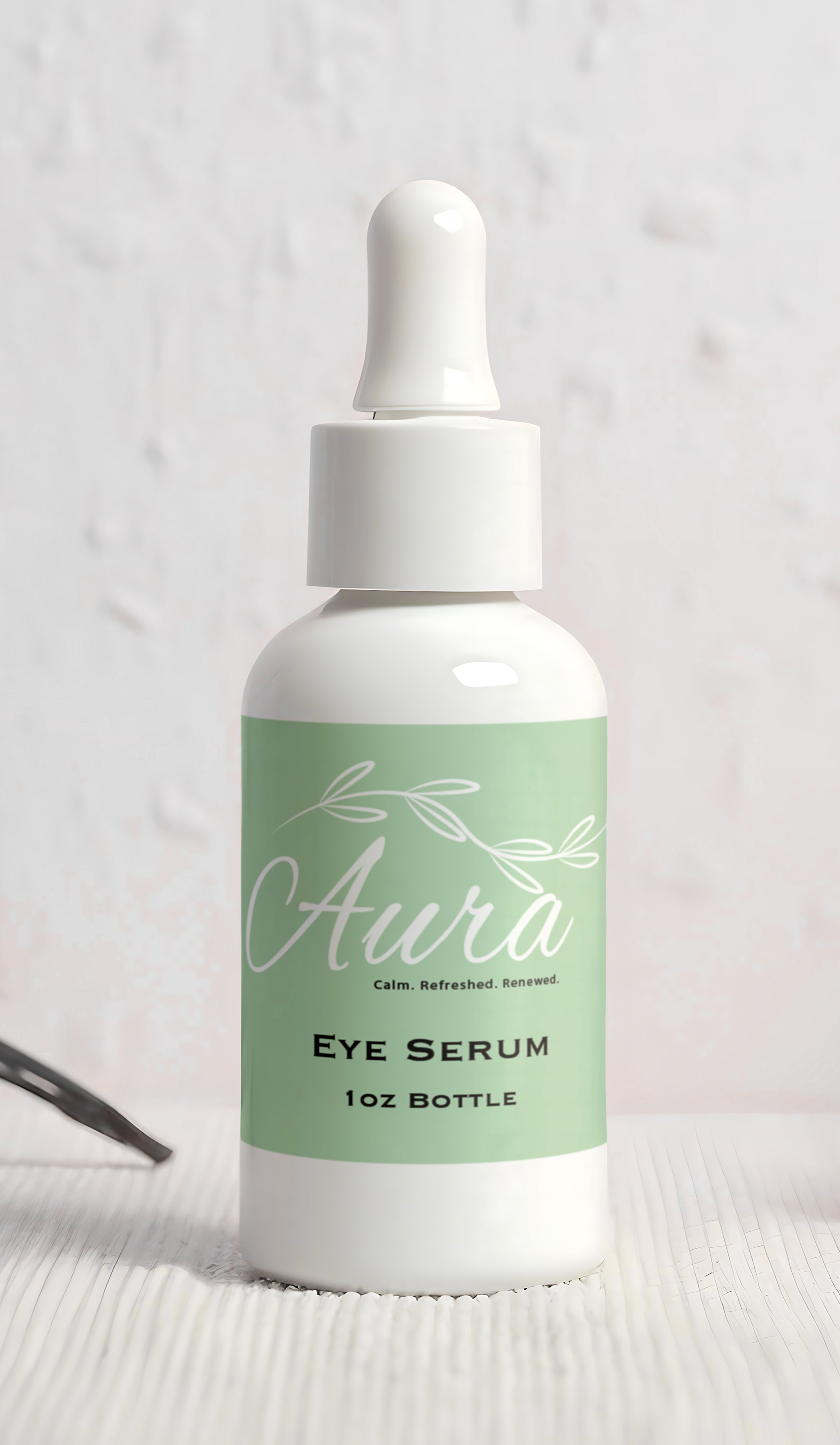
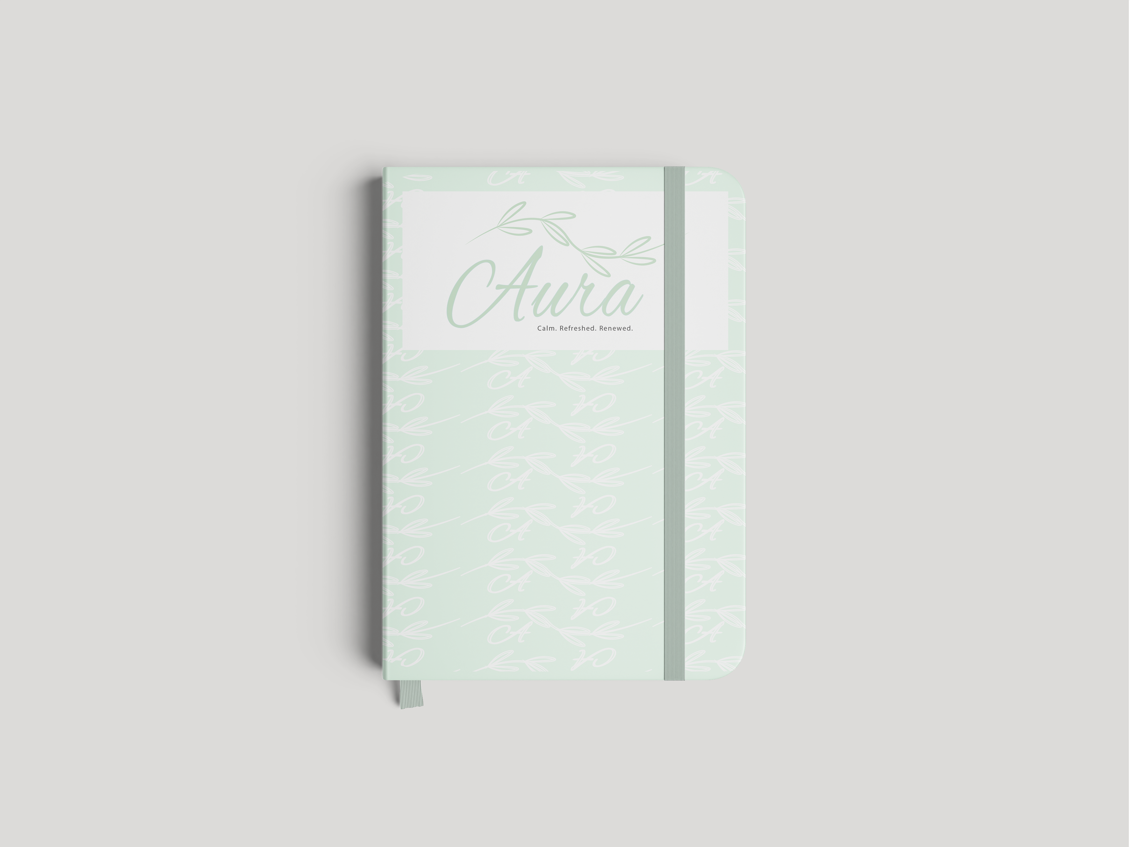
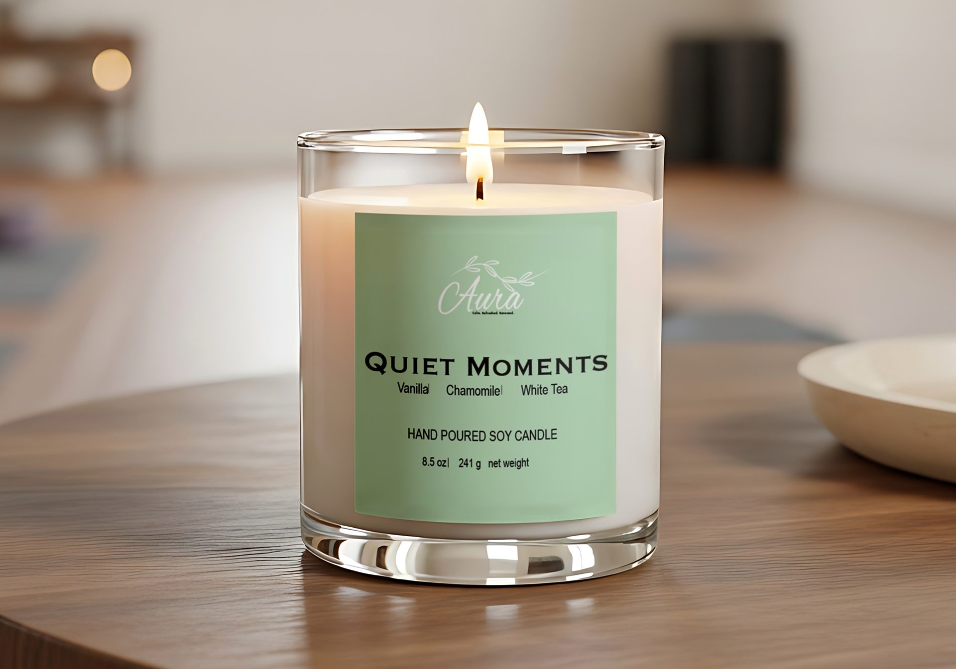
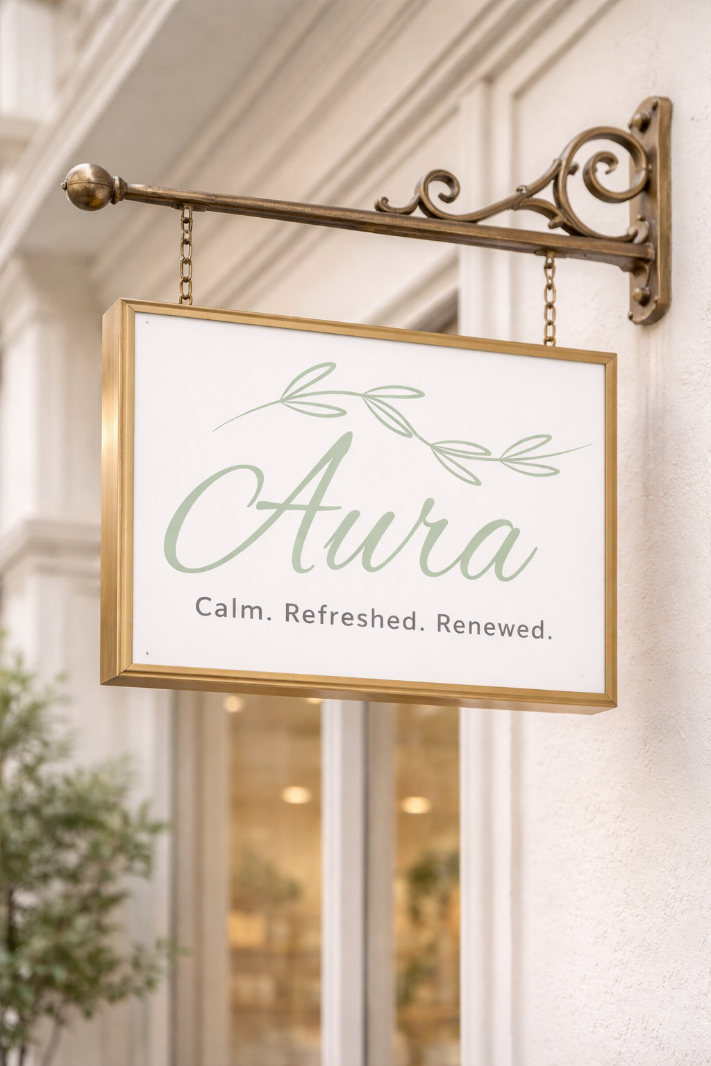
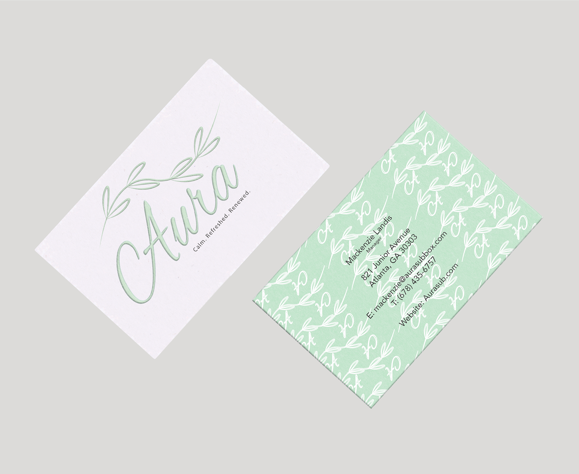
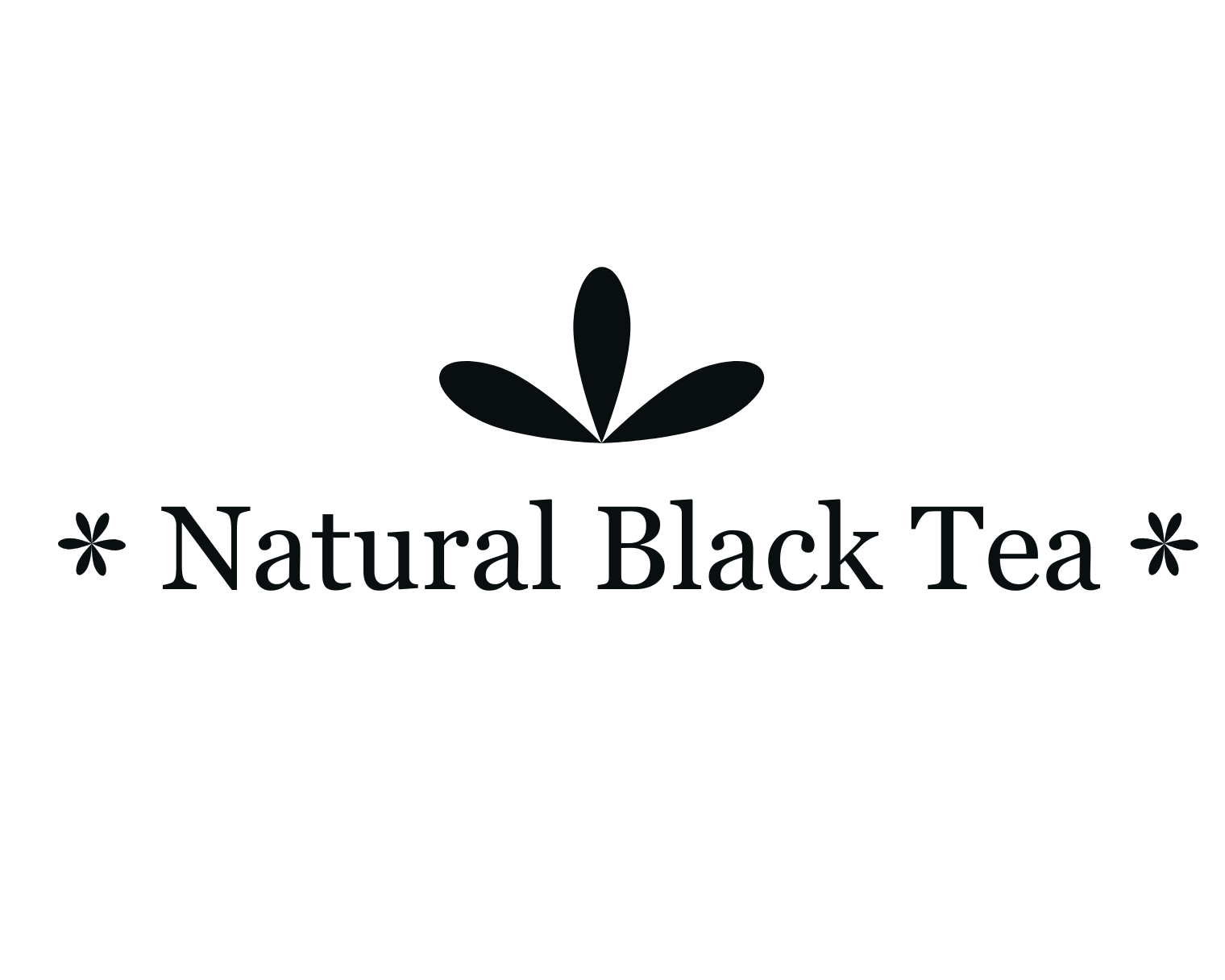
Aura is a relaxation-focused subscription box designed to promote tranquility, balance, and emotional well-being. The brand encourages users to slow down, reset, and reconnect through a thoughtfully curated unboxing experience. The name “Aura” represents the energy, aligning with the brand’s focus on inner peace and renewal.
The logomark features delicate botanical linework to symbolize growth, calmness, and natural healing. The flowing script logotype reinforces softness and ease, creating an inviting and soothing visual presence. A muted green color palette reflects serenity, balance, and nature, supporting the brand’s wellness-driven mission. The overall identity is designed to feel gentle, refreshing, and restorative, positioning Aura as a self-care ritual rather than just a product.