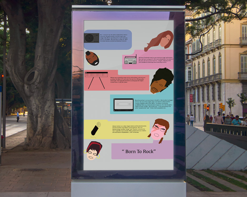
Project Objective:
The objective of this project is to create a cohesive vending machine
brand that combines strong visual identity with user-friendly design. This includes developing the brand name, logo, color palette, typography, and overall aesthetic to ensure consistency across the vending machine and related materials. The project focuses on appealing to a defined target audience while emphasizing clarity, accessibility, and visual impact. By applying branding principles and thoughtful design choices, this project demonstrates how a vending machine can stand out in public spaces and deliver a recognizable, engaging customer experience.
Design Brief:
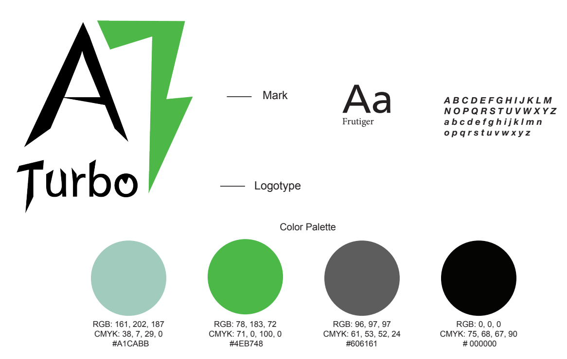
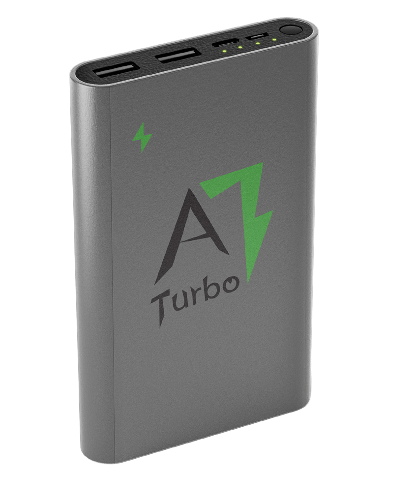
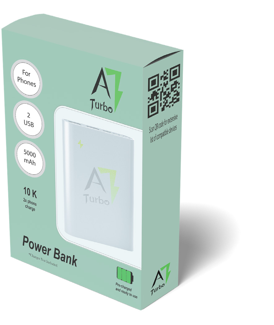
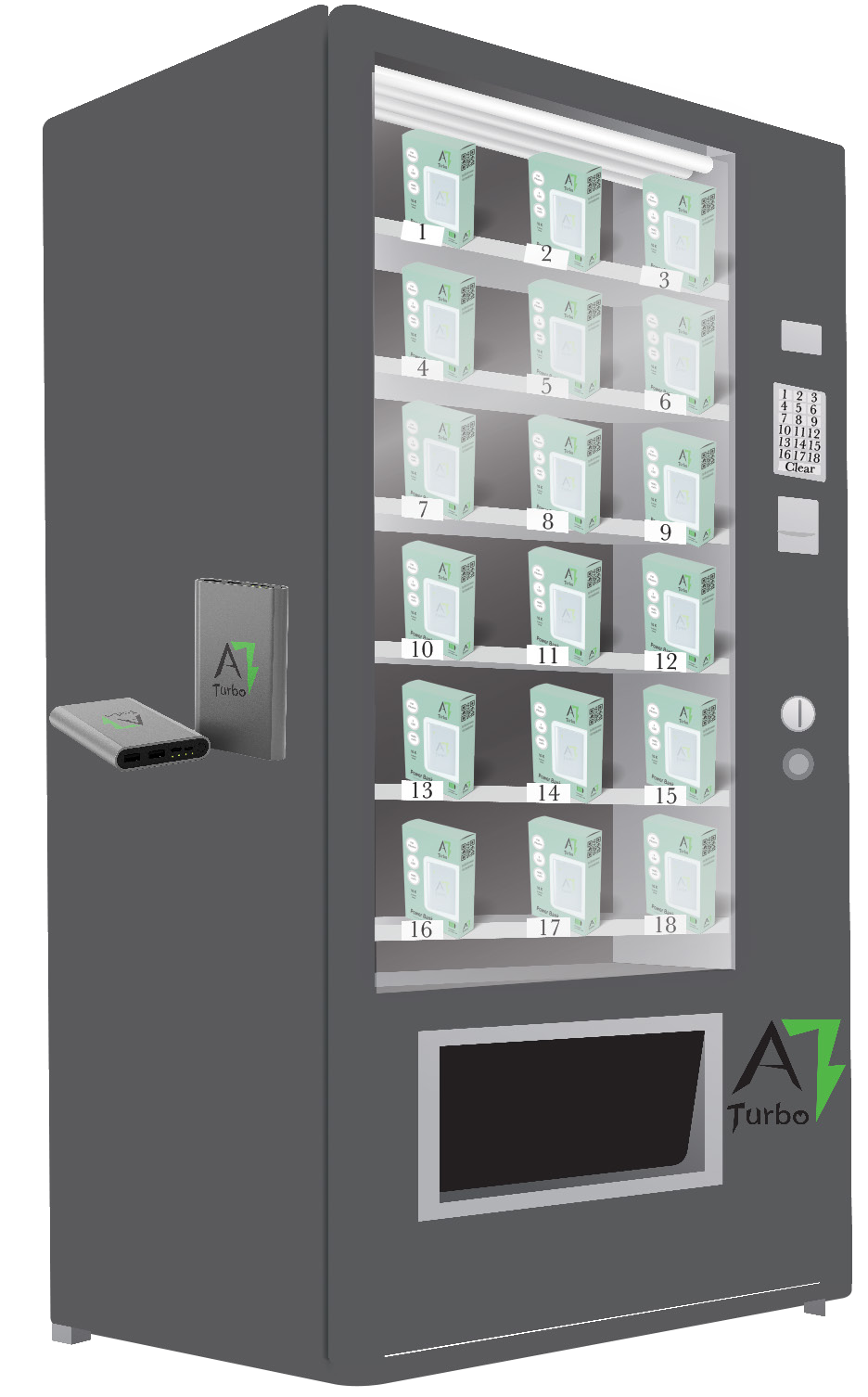
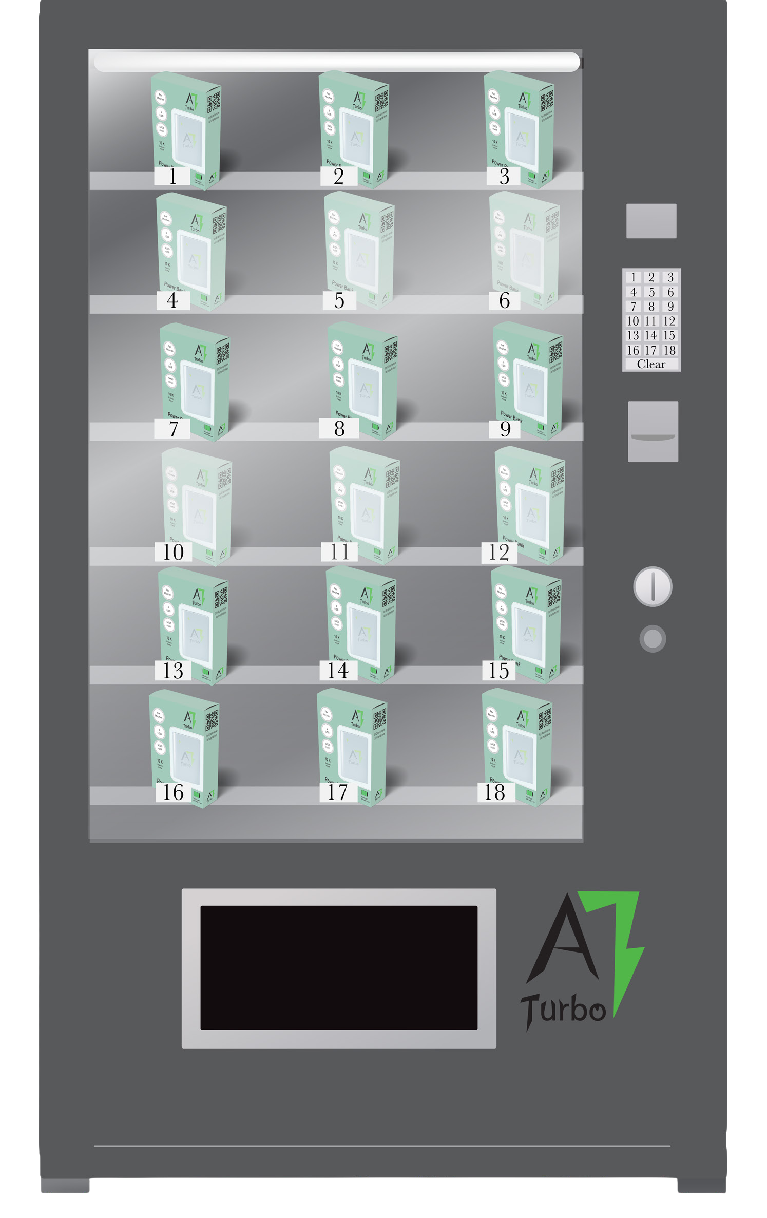
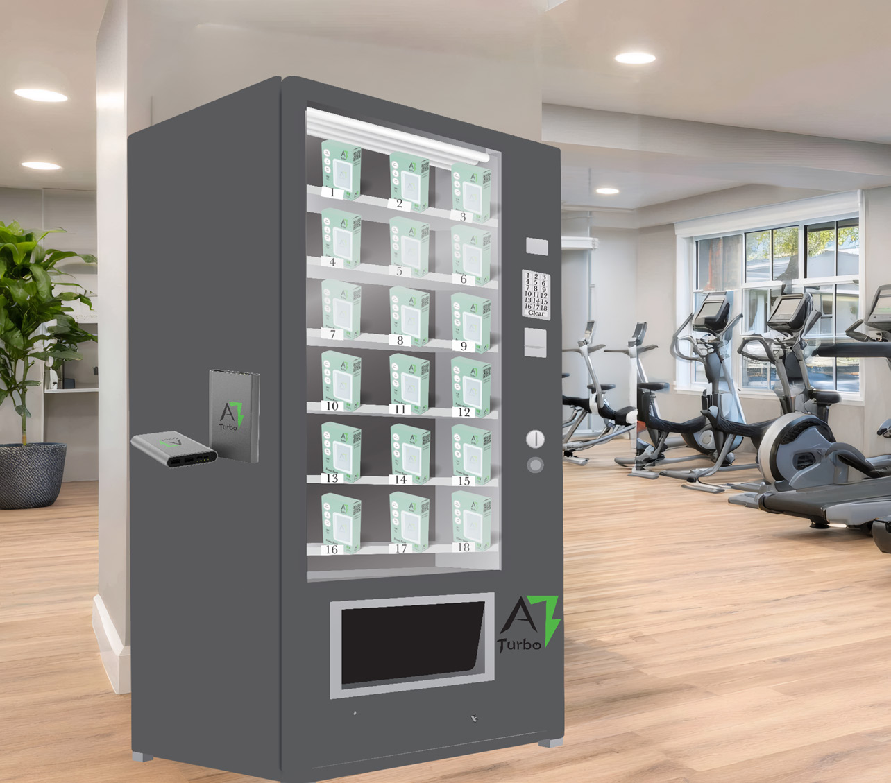
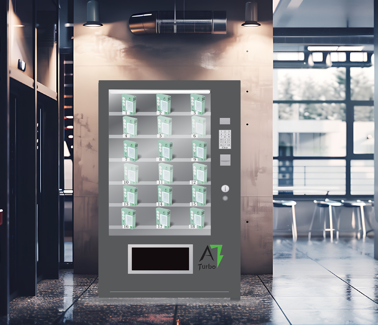
The A Turbo logo is designed to represent speed, power, and modern technology through a bold and energetic visual identity. The sharp, angular letterforms create a sense of motion and strength, while the green lightning bolt integrated into the “1” symbolizes fast charging, energy, and efficiency. The contrast between black and green reinforces clarity and impact, with black conveying reliability and professionalism and green suggesting innovation and eco-conscious technology. The clean, minimal composition ensures the logo is highly recognizable and scalable across packaging, products, and digital platforms. Overall, the logo communicates a tech- forward brand personality that feels powerful, efficient, and accessible to everyday consumers.