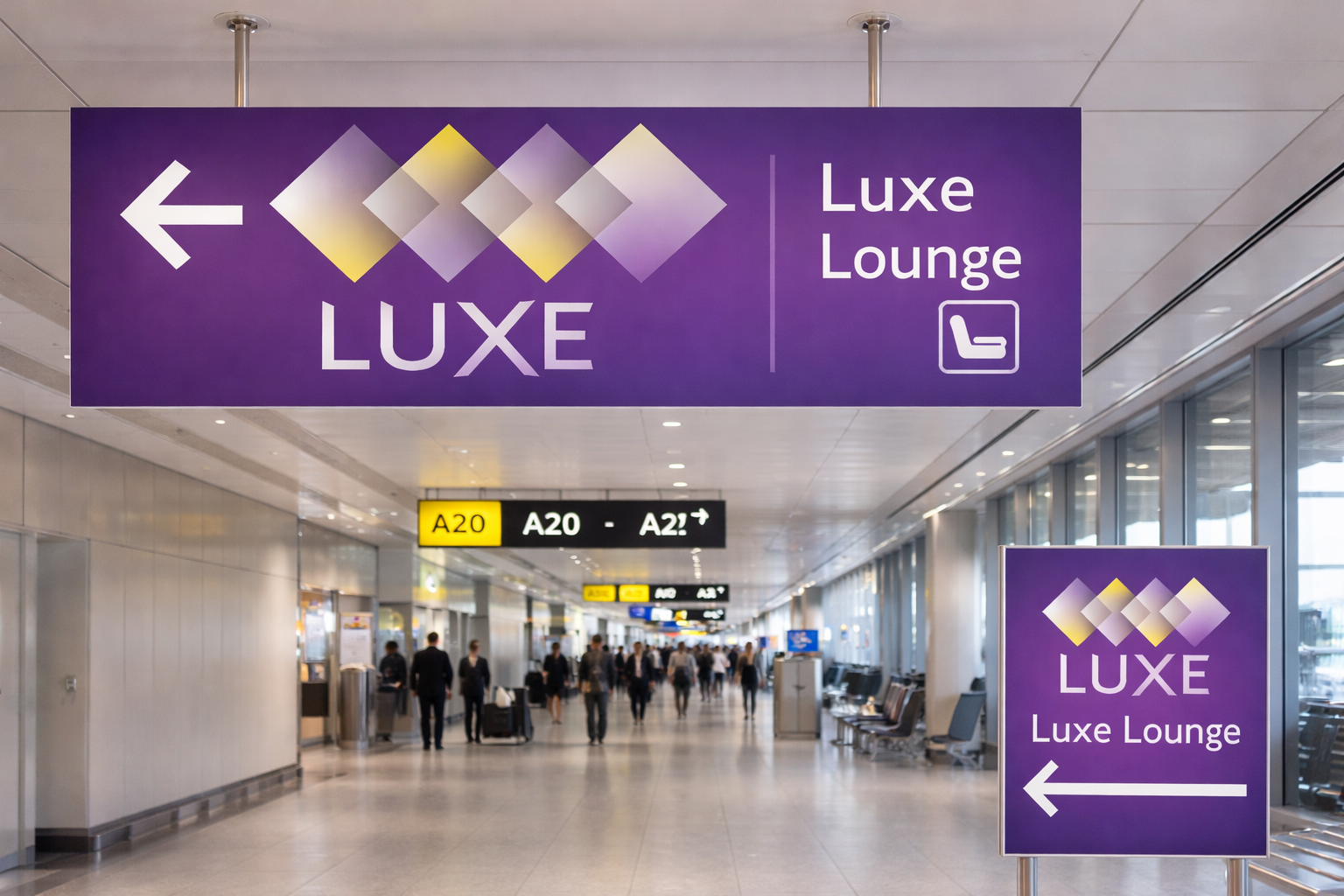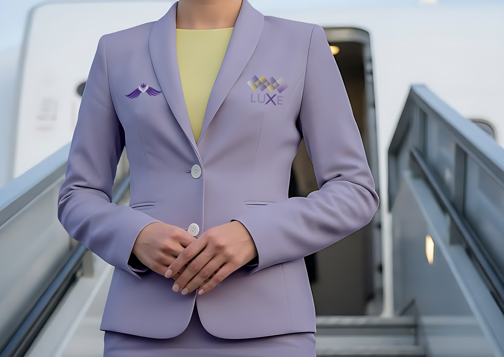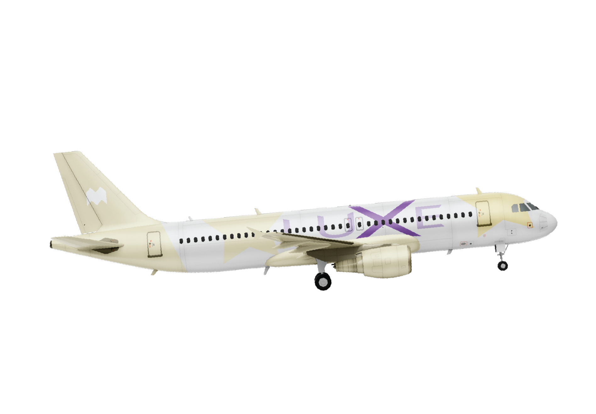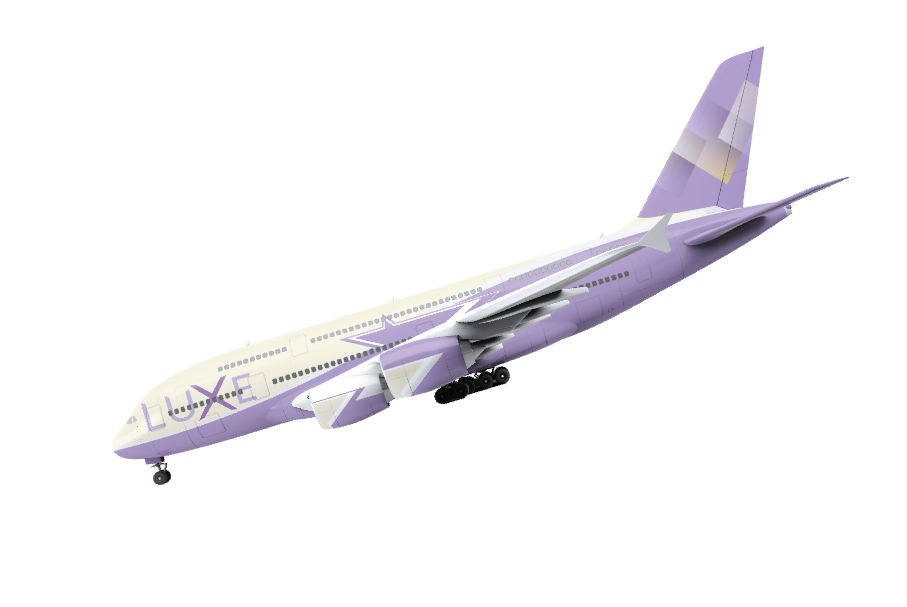
LUXE
Design Objective:
Create a modern airline brand that feels trustworthy, elevated, and easy to navigate. The design uses clean, confident typography and subtle flight- inspired details to communicate movement, clarity, and professionalism across all brand touchpoints.
Create a modern airline brand that feels trustworthy, elevated, and easy to navigate. The design uses clean, confident typography and subtle flight- inspired details to communicate movement, clarity, and professionalism across all brand touchpoints.
Design Brief:
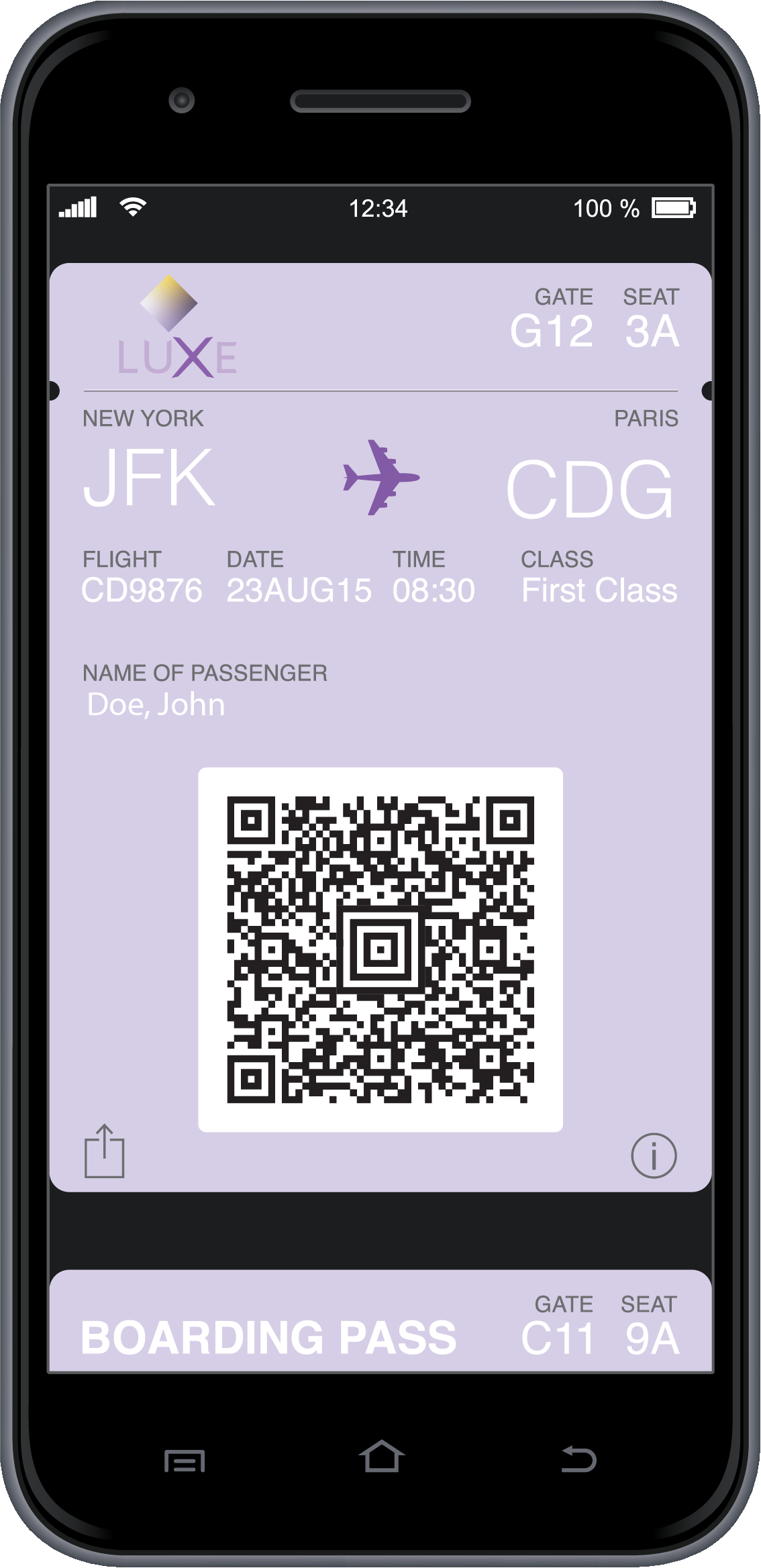
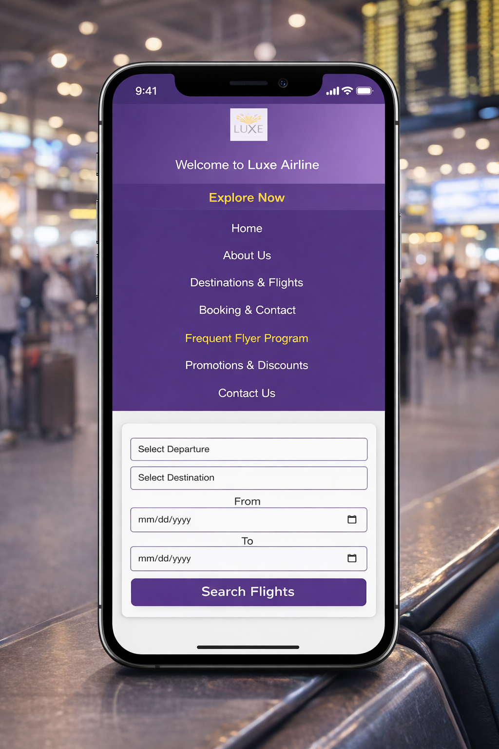
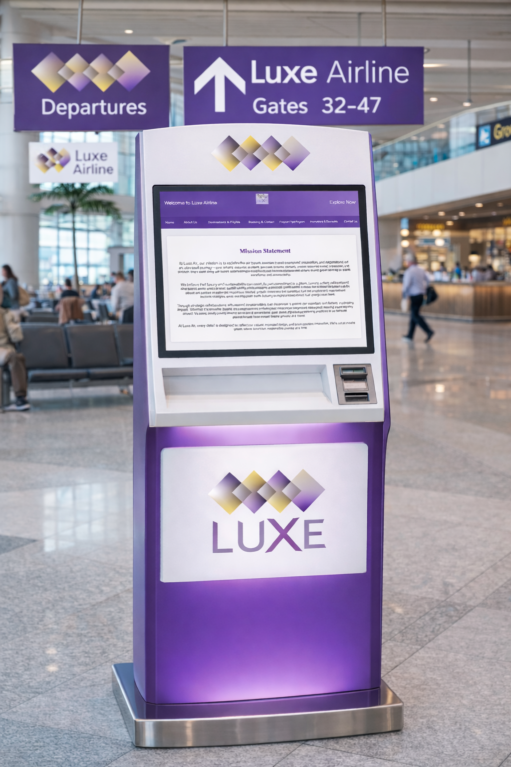
LUXE is a premium airline brand designed to elevate the travel experience through comfort, elegance, and modern sophistication. The brand focuses on providing travelers with a refined, seamless journey while maintaining clarity and trust across all touchpoints. The name “LUXE” is derived from the word luxury, representing exclusivity, high-quality service, and attention to detail, while remaining short, bold, and memorable.
The logomark uses layered geometric diamond shapes to symbolize movement, connection, and the progression of flight. These forms reflect destinations intersecting and paths crossing, reinforcing the idea of global travel and elevated experiences. The gradient transitions within the shapes add depth and fluidity, emphasizing motion and modernity. The logotype complements the symbol through a clean, contemporary typeface with wide spacing,Creating a sense of openness, confidence, and calm. The purple and gold color palette communicates luxury, trust, and sophistication, positioning LUXE as a modern airline brand that values comfort, style, and premium travel.